Thursday, September 11, 2014

Saturday, February 9, 2013

Patton Oswalt Portrait


After watching several Jason Seiler videos, I thought I'd try my hand at some celebrity caricature, just for fun. I did this digitally using Photoshop CS5 and my Intuos4 Tablet.

Thursday, January 31, 2013

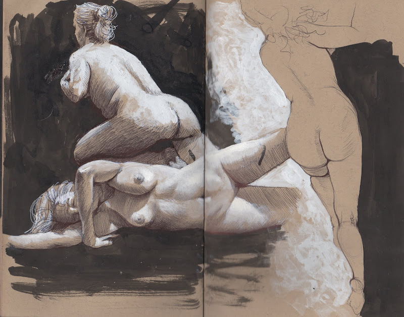
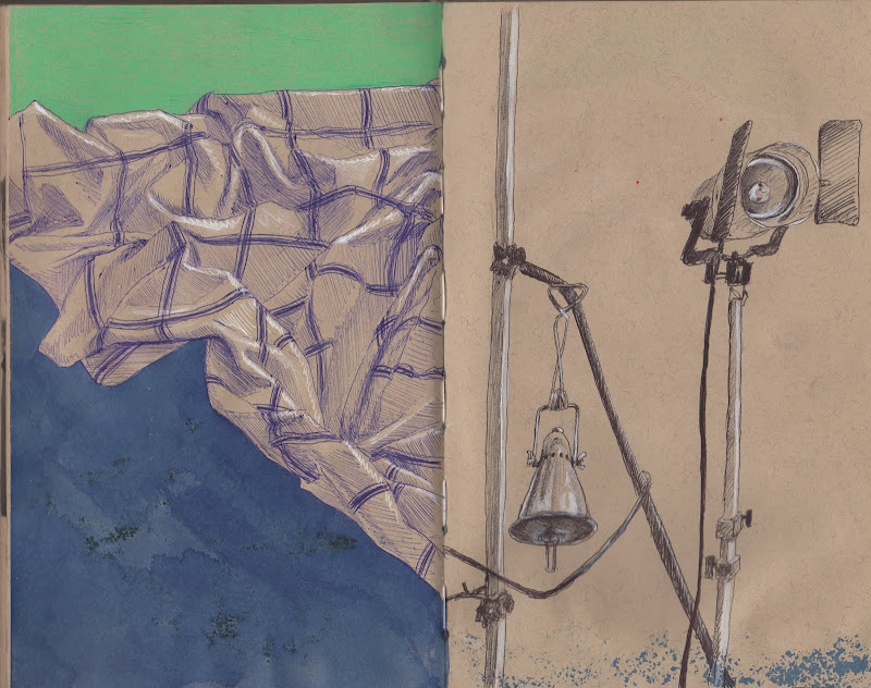
overwhelming sketchbookingness


Here's a well overdue look into my sketchbook. I can't stress enough the importance of drawing from life all the time. If you're an artist you should do this habitually. I like to draw directly in pen (or some other non-eraseable medium) to avoid getting too fussy over my sketches. They're suppose to be quick loose and fun.

Sunday, January 20, 2013

Refrain

Latest personal piece I've been working on. Did this with Graphite and Ink on Bristol Vellum, then scanned the drawing in and finished the colors and textures in Photoshop. Enjoy!
Here is the initial graphite drawing on Bristol Vellum.
Here is the first pass of colors in Photoshop, after I let some ink washes dry. At this stage I didn't have a color scheme in mind I just played around until I found colors that hit the mood I was trying to convey.
Here is the final image after all the tedious level tweaks and self doubt.

Monday, December 17, 2012

scratchboard self portrait

Here's a recent self portrait done on scratchboard. I gave this same assignment to my students at the Governor's School for the Arts, and told them I would do the same project with them. A lot of my students had never done scratchboard work before so they were very intimidated. I got them to break the ice and overcome their "deer in the headlights stare" by doing several drawings on black paper with white chalk to get comfortable with the concept of "drawing the light". The first drawings they did were a little shaky, but I could tell the concept began to sink in. After that, I gave them a demo on how to light a portrait for reference, and then how to scratch into the clay board with different tools for a variety of marks and effects.

I remember in my Art classes I always wanted to see what my instructors/professors work looked like. If I had a figure drawing teacher, I wanted to see what their drawings looked like...painting teacher, I wanted to see their paintings, etc. So I definitely didn't want to negatively affect the confidence of my students by participating in the assignment, but rather teach them by "doing". I also told them up front that if they didn't want me to participate, I wouldn't, but they wound up doing an incredible job on the assignment and they all told me they liked that I did the project with them.

Monday, March 26, 2012

Au Courant Orchestra Series


Here they are ready to hang for the Governor's School for the Arts Faculty Show at the Hermitage Museum in Norfolk, VA. The show will run from May-June and will feature the faculty's work responding to the student's show "Tools of the Creative Mind". These were a blast to work on, a great break from working digitally...I got to knock the rust off of my traditional skills again. Enjoy!

Sunday, March 25, 2012

Au Courant Orchestra II (Breakdown)


Step 4: Final image. Went back and forth between graphite, acrylic washes, and popping highlights with white gouache. The final step was to cover the image with clear acrylic gloss medium because some areas were matte and some were glossy, doing this unifies the sheen of the image and helps, in my opinion, to punch up some of the lost contrast.


Step 3: Layout of background elements, and continuing to tweak the figure's values.


Step 2: Basic portrait and hands. Used graphite and charcoal to keep the rendering soft on the skin.


Step 1: Blocking in basic proportions and values of the figure. Used black acrylic for darkest dark value, ink wash, and graphite for mid tone values.